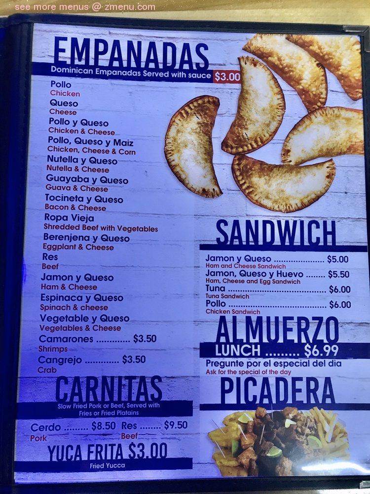
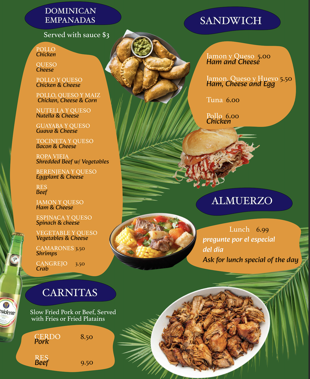
For my project, I have decided to redesign a local Dominican restaurant’s menu. Menus are an important information artifact for every restaurant. They solve many problems and create flow and function, for the business. This type of document details how a dish is prepared, and or cooked, and typically the price it is sold at. This alone solves many issues. It can help people make informed decisions about what they are ordering, which prevents mishaps with dietary restrictions and allergens. Another purpose is helping to ease the workload for hospitality workers such as servers and bartenders, allowing them to focus on other things. That means the document needs to be clear and organized. This type of document should also show personality, which is why I created something that makes you feel like you're in the Dominican Republic. It is tropical, colorful, and feels good to look at. Face it, we like things that look good. Having a beautifully and well-organized menu, could be the sole reason someone chooses your restaurant over another.
For this project, I combined information design and graphic design. Information design is more rooted in applied design research, and the focus of the visual is workability. Meanwhile, graphic design leans towards an artistic approach in which a visual’s success depends on what the audience feels about it. Therefore, the first thing I wanted to tackle is information hierarchy and organization. To go about this, I started with creating the yellow and blue shapes that would contain my main information. This helps to create information hierarchy and keep the most important information consistent looking. I used these ambiguous and not unified looking shapes to create something unique. My goal was to create an non-traditional looking menu. Some rules are meant to be broken!
This restaurant’s main selling point is their empanadas. I wanted to lure people’s eyes to that section first, by putting that section in the top left corner. From there, I filled in these shapes with the information. I used different fonts and colors to differentiate between the proper Spanish name for the dish, and the English translation. I kept this consistent throughout the design to create a sense of cohesiveness. This allows people who speak either language to make informed decisions, while possibly learning how to communicate with someone who may not speak one of the languages. I decided to add in pictures next to each section to aid in people’s decision-making process. It's also a great stylistic choice, to make the menu more visually appealing.
During this project, I was very conflicted on my design choices. I moved things around ALOT, deleted things, and needed other people to give opinions on the work I've done. I started out with very simplified shapes and not many images. I learned to trust myself, while breaking certain sign rules. I trusted the process. I was very set on the colors and elements I wanted to use, but had issues with visibility. Playing around with font and color choices allowed me to keep the concept, but still have a vsibile document.